
Creating logos that communicate who you are, not just what you do
When a Bay Area contractor asked me to design their logo, they showed me a folder of competitor websites. Every single one had a wrench, a hammer, or a house outline. “I want something different,” they said, “but I don’t know what that looks like.” This moment is exactly why our logo design process matters—it creates clarity where most businesses feel stuck.
Your logo isn’t decoration. It’s the face of your business, the first thing people remember, and often the reason they choose you over a competitor. But getting there takes more than a few design tweaks. It takes conversation, strategy, and a process that actually listens.
Why Logo Design Starts with Your Story
Your business has a backstory. You might have left a corporate job to start your own thing. Or perhaps you’re the third generation running a family shop. Others simply spot a gap in the market and decide to go for it.
That story is your foundation. Before we open design software, we need to understand what problem you solve, what makes your approach different, who you’re trying to reach, and what feeling you want your brand to create. Our logo design process begins with these insights, so every design choice has purpose.
A walnut creek general contractor told me they wanted their logo to communicate precision and reliability. With that idea guiding our design, we used strong, clean lines with a grounded color palette. Homeowners told them the rebrand made them feel confident before the first phone call.
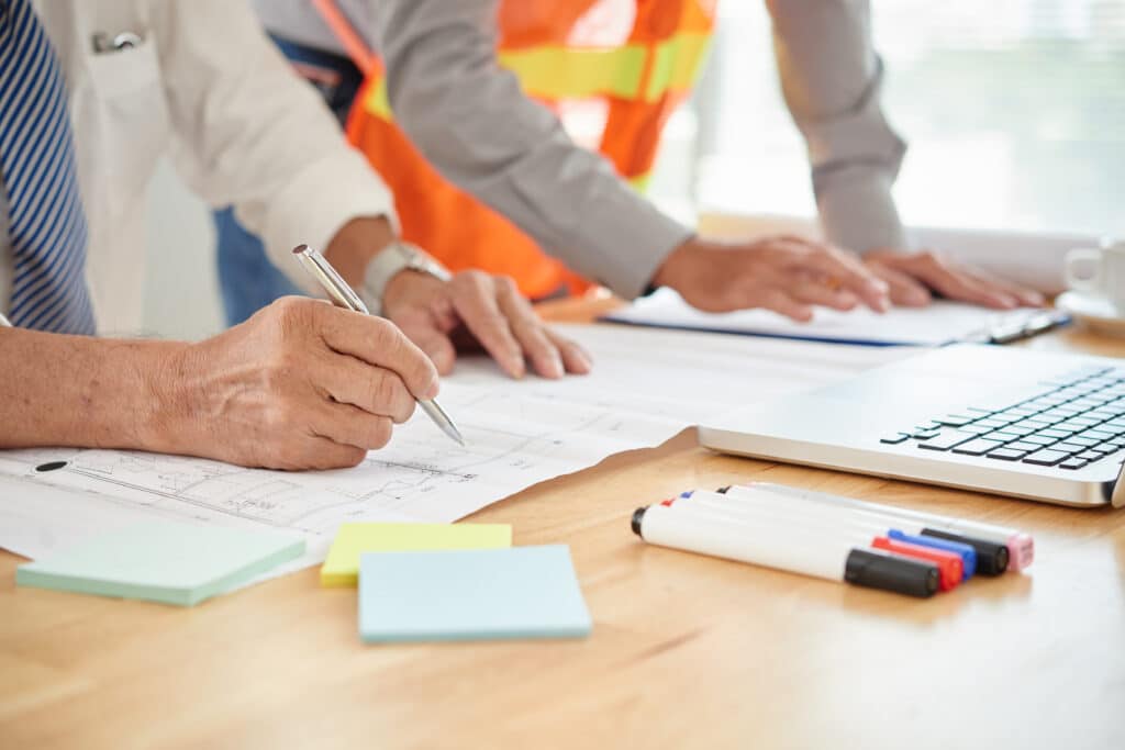
Step 1: Discovery and Brand Strategy
This is where we dig deep. I want to know who your competitors are and how you stand out. What words would your best customers use to describe you? Where will this logo live: signage, website, business cards, trucks, uniforms? What emotions should it trigger?
For a general contractor in Olympia, WA, we found out their biggest selling point wasn’t speed or price. It was trust and craftsmanship. Homeowners wanted someone reliable who wouldn’t just upsell them. That insight shaped everything. We designed a logo with clean lines and a shield element to communicate protection and integrity.
You’ll get a brand strategy worksheet, competitor analysis, mood board with visual inspiration, and clear design direction.
Step 2: Concept Development
Now we start sketching. Not on a computer yet, just rough ideas on paper. This keeps things loose and creative.
We typically create two to three concepts that take different angles. A literal approach shows what you do. An abstract approach uses shapes or symbols to represent your values. A wordmark approach focuses on typography to make your name memorable. A combination approach blends an icon with text.
Step 3: Refinement and Iteration
This is where details matter. We’re adjusting font weight and spacing, color variations for different backgrounds, icon size and positioning, and how the logo works in black and white.
For a boutique hotel in the Caribbean, we took their existing logo with a long standing history behind it and refined it for a more modern, boutique-like feel to the brand. The owner loved our new approach.
When we’re doing logos, you’ll typically see two to three rounds of revisions. If something isn’t working, we fix it.
Step 4: Finalization and Brand Guidelines
Once you approve the final design, I don’t just hand you a JPEG and call it done. You get vector files for print and large-scale use, PNG files with transparent backgrounds, high-resolution and web-optimized versions, color codes, font specifications, and usage guidelines. These will be stored in your customer account with us for your easy and convenient access anytime you need to download them.
Our usage guidelines explain how to use your logo correctly: minimum size, spacing rules, what not to do like stretching it or changing colors. This keeps your brand consistent whether you’re printing business cards or wrapping a van.
For businesses planning to grow, I also include secondary logos, icon-only versions, and social media profile images. Everything you need to show up professionally across every platform. The entire process typically takes two to four weeks from discovery to final files.
By the end of our logo design process, you walk away with a brand identity built for long-term growth.
Curious how strong your current branding is? Request a free brand review.
Why This Process Works for Bay Area Businesses
Bay Area customers are savvy. They notice details. A poorly designed logo signals that you cut corners. A thoughtful logo builds trust before you say a word.
I’ve worked with contractors who saw more inquiries after rebranding. A San Pablo based contractor told me customers mentioned the new logo when they called. It made them feel like the business was professional and established, even though it was the same team doing great work all along.
Your logo isn’t just a pretty picture. It’s a business tool. When done right, it makes you memorable in a crowded market, communicates your values instantly, works across every customer touchpoint, and grows with your business.
How Logo Design Fits into Your Larger Growth Plan
A logo is one piece of your brand. It should connect to your website design, your messaging, and your customer experience.
When we design logos at Tenaya360, we’re thinking about the long game. How will this look on your site in five years? Will it still feel relevant as your business evolves? Can it adapt if you expand services or locations?
Ready to Build a Logo That Tells Your Story?
Your business deserves a logo that does more than look nice. It should communicate who you are, build trust with customers, and scale as you grow.
If you’re ready to move beyond generic templates and create something that actually represents your Bay Area business, let’s start with a conversation. No pressure, just a chat about where you’re headed and how branding fits in.